These days, Team Typed is busy with the branding of Typed. We consider Typed important as a brand- which is evident by the fact that there are dedicated team members in charge of BX and UX despite the product’s early stage; which is not usual as a startup in its initial stage. However, as many people working in startups agree, branding as a startup in its initial stage is not an easy task. We also face such difficulties all the time. So, I, who is in charge of BX, and Seungmin, who is in charge of UX, decided to write an article about the branding of Typed, especially focusing on brand naming and design to share the current progress and the difficulties we faced.
Typed’s Branding History
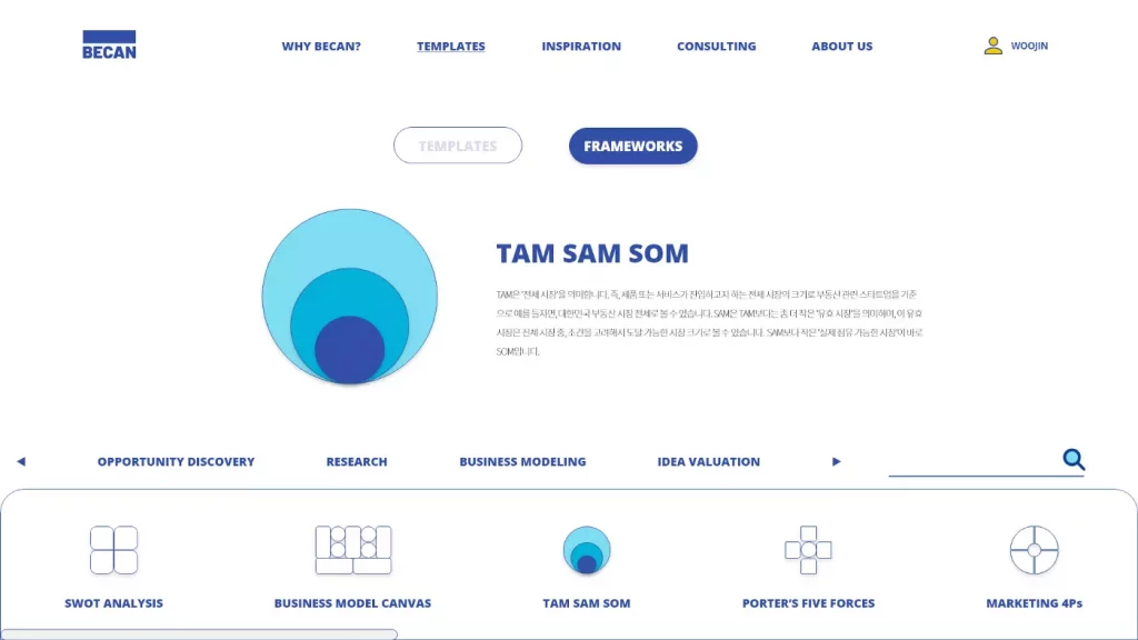
BECAN: Document Tool for Business Plans
The starting point of Typed was to create a tool which allows prospective entrepreneurs, whether they majored in business administration or not, to easily create a business plan. In the past many people, including prospective entrepreneurs, had the perception that ‘creating a business plan is difficult’. Therefore, we needed to position ourselves as ‘a business plan that anyone can create easily’, and we also needed to be able to portray the vision that a well-made business plan would bring to each prospective entrepreneur. (That is why it was called ‘CEO Maker’ initially.)
We discussed the potential names of the service and finally selected ‘BECAN’, as it was an abbreviation of the company name ‘Business Canvas’. ‘BECAN’ was also a combination of the word ‘BE’, which means ‘to become something’ and ‘CAN’, meaning ‘to be able to’.
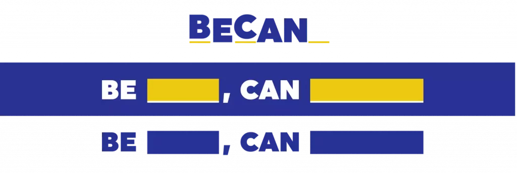
Therefore, BE _, CAN _ was selected as one of the slogans so that prospective entrepreneurs could fill their vision in the blank, and blue was used as the main color to show the ‘trust’ that a business plan should give. Yellow was used as a secondary color, as it symbolizes ‘friendliness’ and ‘ingenuity’.
For illustration, two main colors were chosen, and other colors and outlines were used to add vibrancy to the rigid business plan framework.
Typed: Business Document Creation Tool
Then, BECAN expanded its scope from merely creating a business plan to creating business documents in general. This did not just happen overnight. We searched and planned the functions that customers really wanted based on market research and customer interviews in order to make a tool that can create not only business plans but also business documents.
This caused a major shift in the branding of BECAN. First, we needed to change the naming of BECAN. Even when we thought about the persona only in terms of profession, the scope was expanded from prospective entrepreneurs to all professions that require business document creation. Due to this change, BECAN became a name that limited the characteristics of our product. Therefore, a discussion on the naming started and ‘Typed’, which was suggested by Jinyoung, who is in charge of development in our team, was voted and chosen as a new name.
Typed has two meanings. First, it has the meaning of ‘evolution of Word’. Word, which has long established itself as the world’s standard for creating documents, was a passive software where users had to write everything themselves on a white sheet of paper. However, Typed has a vision of becoming a proactive software that makes writing documents easier by predicting and recommending all the information that users want. Therefore, the name Typed represents the evolution of creating a document; a generational shift.
In Typed, the past tense ‘-ed’ refers to the completeness of the document, which means fully creating a document. In addition, documents created through Typed are also complete and research-based. The naming has a connotation of these types of documents.
The word Type became the starting point of the entire branding process. The identity of Typed is shaped based on our imagination that Microsoft Word, the current de-facto software, is replaced by Typed- and that said, the act of writing is changed into ‘Typing’, and the writer, who creates document, is replaced by ‘Typer’.
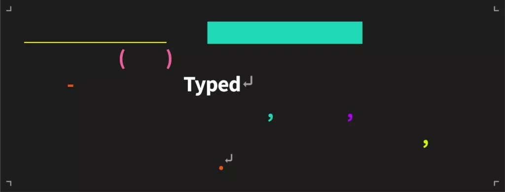
From the perspective of design, we added a newline symbol ⏎, which is used at the end of each paragraph in the word processing tool, and at the same time is the Enter key which is tapped every time a paragraph is completed. The intention of this was to emphasize the meaning of completeness. In addition, in order to demonstrate the ‘professionalism of business documents’ rather than just ‘a business plan that anyone can make’, the most basic colors, Black & White, were set as the main colors to give a professional touch. Furthermore, vivid colors were chosen as point colors to reduce the dullness of business documents.
In the branding of Typed, not only logos and colors, but also specific cases that could be used as branding elements were defined clearly. Words related to type (Type, Typed, Typing, …) were made to use capital ‘T’ even if they were in the middle of a sentence, and the point color was used only for punctuation marks or decorative elements in the sentence. Space and line break symbols were used as an asset to make sure that space symbols are used around Type-related images and line break symbols at the end of paragraphs.
Typed: Knowledge Management-Based Document Creation Tool
However, the characteristics of Typed are constantly changing. As the product became more sophisticated, the product was clearly different from what was initially expected. Typed, which started out as a business plan creation tool, has now been reorganized into a knowledge management-based document tool.
Difficulties in branding faced by early-stage startups
As we progressed through these stages, there were two major difficulties that we faced. The first was that it was impossible to fully establish a brand identity, as product ideas encounter big and small pivots constantly. It is rare for a product to be released with a 100% identical implementation of the original idea. All startups go through the process of finding PMF through numerous market research and user feedback, and refine their ideas into gems. Even if it seems as if there are only slight changes in ideas, these changes are accumulated to make big direction changes in the product; and this was the difficult part in branding as an early-stage startup.
Therefore, we had to design with the variability of branding in mind. It was more important to clearly distinguish what the framework was and clarify its identity rather than setting detailed regulations. In the case of early-stage start-ups, one does not work with a team of designers, but in most cases with one or two designers. That’s why we prioritized picking out points that would make the brand strongly recognizable to customers, rather than focusing on regularity.
The second was the conflict between BX and UX. Initially, we tried to build the product design around brand design. As customers should have the same experience in all the areas they interact with the brand, we felt that UX should also provide the same brand experience accordingly as part of the brand. But there was a big mistake in this correlation. Regardless of whether ‘UX is an inclusive relationship with BX’ or not, the essence of product-oriented service was that UX exists at the core of BX. As a result of designing the UX design system around BX, there were many parts that were difficult to apply in practice, and there were parts where BX and UX were separated. Since ‘what kind of experience is provided to users’ greatly affects ‘how users experience the brand’, we made a new start from BX-centered UX to UX-centered BX.
Enquête Team Typed
Phase 3 of the Typed branding started with how Team Typed members perceive Typed. In order to deliver the brand identity to customers, internal branding had to be clear. Therefore, we first summarized the thoughts of Team Typed members through Typeform. Some of the interesting or important results for branding are presented below.
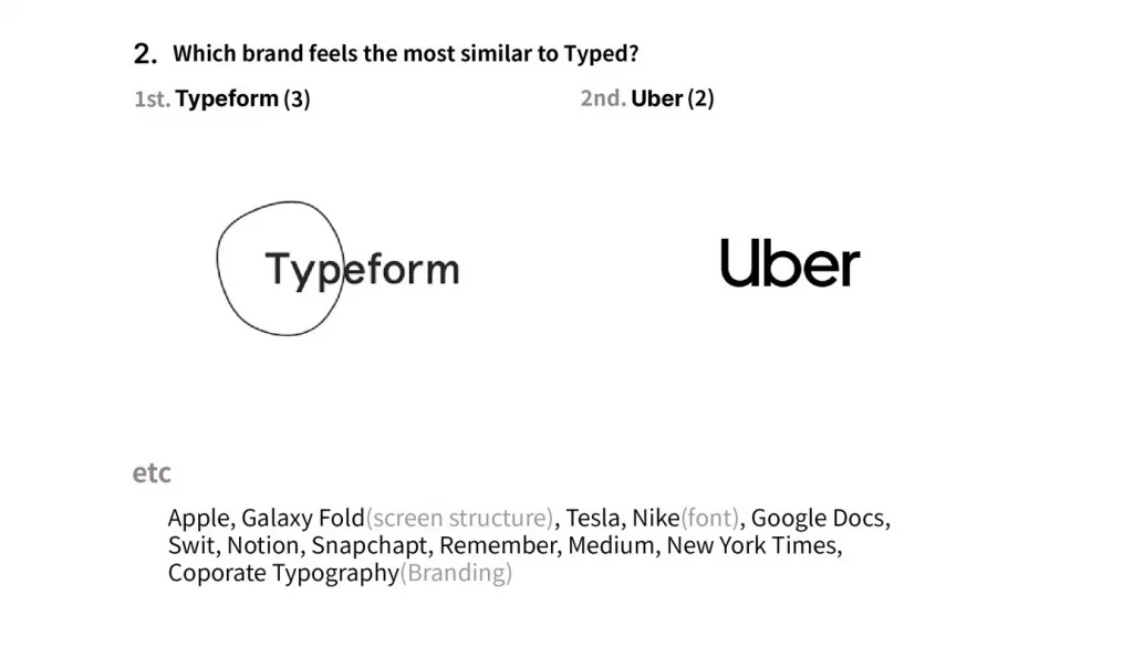
The brands that seemed most similar to Typed were brands with a modern touch that use monotone colors such as black and white and gothic fonts. Typeform may also have been selected due to the similar naming.
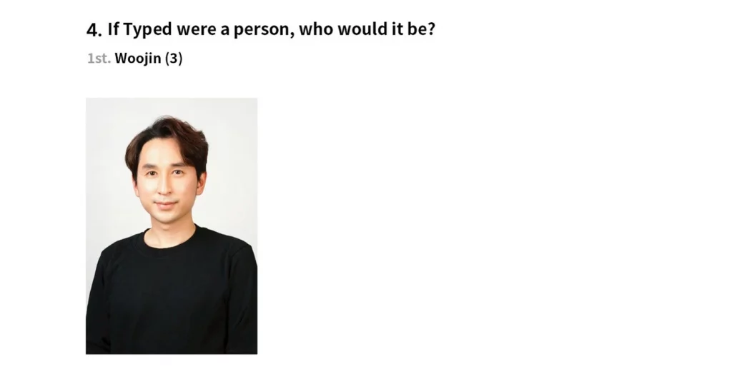
When asked ‘if Typed were a person, who would it be?’, Woojin, Team Typed’s leader, was mostly answered. It seems that the DNA of the CEO is inevitably reflected in the brand identity.
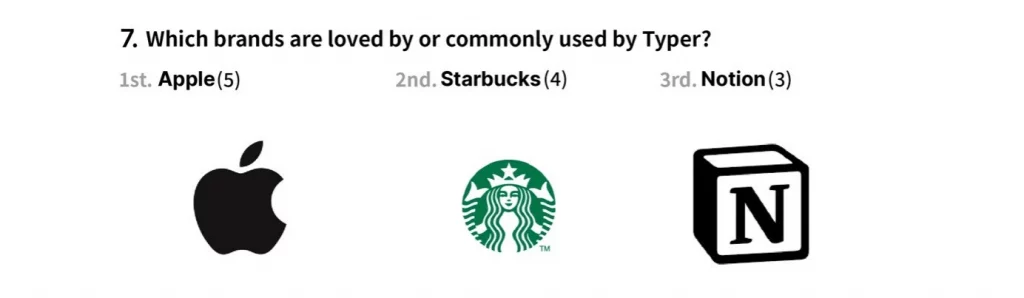
Typer, the persona of Typed, was also very clear. The persona can be defined as ‘the person who is working on Notion on a Macbook by the windows of Starbucks.
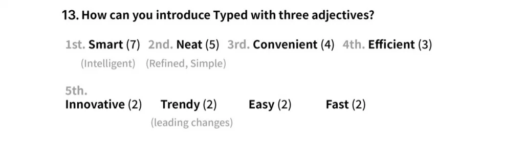
Finally, when asked to introduce Typed using three adjectives, ‘smart’, ‘organized’, and ‘convenient’ were selected.
Brand of Typed Continues
Based on the results above, we started branding specifically by organizing a branding TF team composed of marketers and designers.